
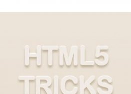
HTML5 CSS3立体可旋转3D文字特效
六久阁织梦模板网文字特效 浏览:0 次HTML5 CSS3立体可旋转3D文字特效代码如下: !DOCTYPE htmlhtmlhead meta charset="UTF-8" titleHTML5/CSS3 3D文字特效DEMO演示/title stylehtml{font-family:sans-serif;-ms-text-size-adjust:100%;-webkit-text-size-adjust:100%}body{margin:0}article,asi
 HTML5 CSS3乳白阴影文字效果投影特效
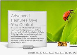 jQuery立体缩略图切换特效
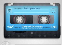 html5音频播放器制作复古的卡式录音机
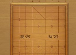 js html5网页版中国象棋游戏源码

HTML5 CSS3立体可旋转3D文字特效代码如下:
<!DOCTYPE html>
<html>

<head>

  <meta charset="UTF-8">

  <title>HTML5/CSS3 3D文字特效DEMO演示</title>

  <style>
html{font-family:sans-serif;-ms-text-size-adjust:100%;-webkit-text-size-adjust:100%}body{margin:0}article,aside,details,figcaption,figure,footer,header,hgroup,main,nav,section,summary{display:block}audio,canvas,progress,video{display:inline-block;vertical-align:baseline}audio:not([controls]){display:none;height:0}[hidden],template{display:none}a{background:transparent}a:active,a:hover{outline:0}abbr[title]{border-bottom:1px dotted}b,strong{font-weight:bold}dfn{font-style:italic}h1{font-size:2em;margin:0.67em 0}mark{background:#ff0;color:#000}small{font-size:80%}sub,sup{font-size:75%;line-height:0;position:relative;vertical-align:baseline}sup{top:-0.5em}sub{bottom:-0.25em}img{border:0}svg:not(:root){overflow:hidden}figure{margin:1em 40px}hr{-moz-box-sizing:content-box;box-sizing:content-box;height:0}pre{overflow:auto}code,kbd,pre,samp{font-family:monospace, monospace;font-size:1em}button,input,optgroup,select,textarea{color:inherit;font:inherit;margin:0}button{overflow:visible}button,select{text-transform:none}button,html input[type="button"],input[type="reset"],input[type="submit"]{-webkit-appearance:button;cursor:pointer}button[disabled],html input[disabled]{cursor:default}button::-moz-focus-inner,input::-moz-focus-inner{border:0;padding:0}input{line-height:normal}input[type="checkbox"],input[type="radio"]{-moz-box-sizing:border-box;box-sizing:border-box;padding:0}input[type="number"]::-webkit-inner-spin-button,input[type="number"]::-webkit-outer-spin-button{height:auto}input[type="search"]{-webkit-appearance:textfield;-moz-box-sizing:content-box;box-sizing:content-box}input[type="search"]::-webkit-search-cancel-button,input[type="search"]::-webkit-search-decoration{-webkit-appearance:none}fieldset{border:1px solid #c0c0c0;margin:0 2px;padding:0.35em 0.625em 0.75em}legend{border:0;padding:0}textarea{overflow:auto}optgroup{font-weight:bold}table{border-collapse:collapse;border-spacing:0}td,th{padding:0}

</style>

    <style>
body {
  background-color: #444;
}
div {
  width: 600px;
  height: 100px;
  margin: 100px auto;
  perspective: 1000px;
  perspective-origin: 50% -200px;
}
h1 {
  text-align: center;
  text-transform: uppercase;
  font-size: 3em;
  letter-spacing: 0.1em;
  color: #EEE;
  animation: rotate 2s ease-in-out alternate infinite;
}
h1:before {
  content: attr(data-shadow);
  color: transparent;
  text-shadow: 0 0 15px #111;
  position: absolute;
  z-index: -1;
  margin: -0.1em 0 0 0;
  animation: skew 2s ease-in-out alternate infinite;
  transform-origin: bottom;
}
@keyframes rotate {
  from {
    transform: rotateY(-10deg);
    text-shadow:  1px -1px #CCC,
                  2px -1px #BBB,
                  3px -2px #AAA,
                  4px -2px #999,
                  5px -3px #888,
                  6px -3px #777;
  }
  to {
    transform: rotateY(10deg);
    text-shadow:  -1px -1px #CCC,
                  -2px -1px #BBB,
                  -3px -2px #AAA,
                  -4px -2px #999,
                  -5px -3px #888,
                  -6px -3px #777;
  }
}
@keyframes skew {
  from {
    transform: scaleY(0.3) skewX(-15deg);
  }
  to {
    transform: scaleY(0.3) skewX(-20deg);
  }
}
footer {
  position: fixed;
  bottom: 0;
  right: 0;
  font-size: 13px;
  background: #DDD;
  padding: 5px 10px;
  margin: 5px;
}
</style>

    <script src="js/prefixfree.min.js"></script>

</head>

<body>
<div style="text-align:center;clear:both;margin:20px auto">
<script src="/gg_bd_ad_720x90.js" type="text/javascript"></script>
<script src="/follow.js" type="text/javascript"></script>
</div>
  <div>
  <h1 data-shadow="CSS 3D Lettering">
    CSS 3D Lettering
  </h1>
</div>

  <script src='js/jquery.js'></script>

</body>

</html>
HTML5 CSS3乳白阴影文字效果投影特效
« 上一篇
2017年06月24日
超炫超酷CSS3文字特效集锦
下一篇 »
2017年06月24日

有问题在这里提问,阁主会为你解决!
- 全部评论(0)

还没有评论,快来抢沙发吧!